Friday, 25 July 2014

The Shock Of The Crude: Welcome to the world of Art Gekko


"I create nothing. I own. We make the rules, pal."


  Gordon Gekko


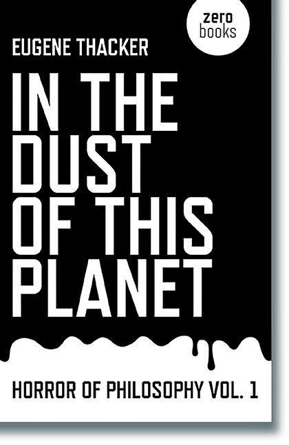
Here's a book cover. Note the publisher's logo, Zero Books, is on the cover. See? Right at the top right corner.


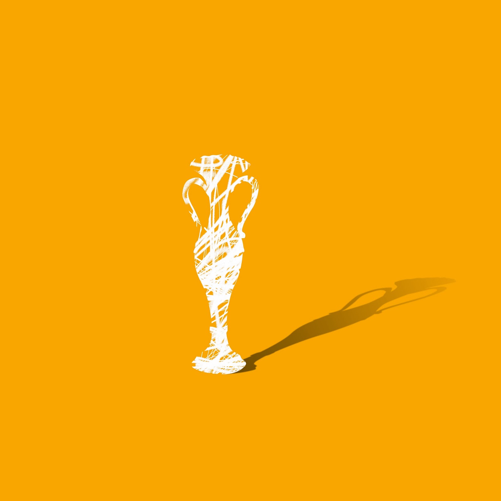
Right, now here's a painting which to the casual observer looks very much like the cover I've just shown you:


Here it is in situ at the Maureen Paley Gallery in 2012:


Notice the title of the book. Notice how the words on the painting actually resemble the title of the book.

Also notice how the lettering looks more than vaguely like the lettering on the book cover.


No permission was sought to use it; no reference made to the book at all.


Here's the artist. Yes I know, but read on. He's a gallery darling and what he does is some serious fucking shit you bitches.


                                                                                 GARDAR EIDE EINARSSON


MORE STUFF FROM GARDAR .
SERIOUS SHIT, MOTHERFUCKER
"...A Norwegian born artist, now living and working in both New York and Japan, Einarsson’s often text-based works come with a certain irreverence...(sic)"

From the Maureen Paley Gallery 2012

So the buyer possibly thinks, "How cool of Einarsson; he's like Norwegian and I guess it takes a melancholic hipster to  celebrate some slogans that he's seen on a street somewhere in Queen's or the Bronx and throw it back in our faces. Like the Beatles and the Animals way back when they gave us back black music..."

The excitable buyer probably thinks that this tattooed purveyor of despair has probably taken his choice nugget from a meth cook's wall in Flint, Michigan or the side of an old Detroit car plant. 

But he didn't; he copied a fucking book jacket.

With one important omission. The logo. The Zero Books logo. So that we're left in no doubt that he's as shallow as his photograph suggests.


My friend Tariq Goddard (same age as Einarsson) runs Zero Books. For a monthly wage that wouldn't get him one of the sleeves of the cool jacket below, he works hard as an author and publisher. Zero is a brave, radical venture that gives voice to left wing thinkers who represent a growing, intellectual subculture that won't find any mainstream publishers breaking down their kitchen doors to start bidding wars. In a nutshell, Jeremy Clarkson would hate them. You get my drift.


"In his hands, surprisingly, the literal exploration of the thematic ’law is for the protection of the people' creates a non-didactic environment latent with ambiguity."
Tariq is possibly the most eloquent person I know; he's a philosophy graduate and the author of six novels. And this is the sort of crap he had to look at when researching the lissome Einarsson:

"His text-based works... offer an often politicised view of contemporary society and an authoritative claim on appropriation that brings attention to the idea of authorship that has concerned postmodernist thought since Foucault’s proclamation of  “the death of the author.”

Er, so that's all right then.

The leather jacket above, incidentally has featured in a Jay-Z video. The one with Beyoncé. I'd like to show you a still from it, but I daren't risk the lawsuit.

Tariq must be so fucking fed up with this. He's received not one red cent from all this trading on a Zero title. Nothing. 


He's written to the the artist, who, hilariously, suggests the lettering wasn't exactly traced (he couldn't be arsed to put in the curves on the letterforms), and that, really, er, actually he's been in touch with lawyers and that Tariq doesn't have a sustainable case.

This is what his picture should have looked like.  

Not quite so cool for the artist, though. How would he explain it? A book cover? Fuck off. You'll get sued.


Andy Warhol would have done it. Even though Robert Hughes didn't rate Andy's intellect; at least Warhol was honest.

So...

Welcome to Art Gekko. Remember Gordon Gekko? He was the enviously-coiffed money suit played by Michael Douglas in Wall StreetA film made memorable by the 'Greed is good' mantra? Remember the "Lunch is for wimps" schtick as he does another deal to make the midday worth a half-million? It summed up the 80s to a lot of people. Corporate nasties sucking the fun and vagueness out of everyone's lives, and giving us Donald Trump; humourless and stupidly rich and resembling Michael Douglas' creation perfectly. 

Apart from the coiffure. Even his budget can't get him one good hair day.


     Dutch Masters ll    Larry Rivers  c1963

My personal interest in art started when I saw my first Larry Rivers painting reproduced in a mid-60s Studio Magazine, provided for the Sandown Grammar art room. It still thrills me; a painting based on a cigar box, it was called Dutch Masters ll.

It was art of appropriation; we knew it and we knew where it came from. People started to take an interest in their environment, or rather realise that artists were painting new landscapes.


ANDY'S SOUP CAN (WITH LOGO)
Andy Warhol will probably be remembered as the artist who was 60s America; the workaholic who didn't sign many of his paintings; the confusing genius who probably made more money out of Campbell's Soup than their sales force for the whole of 1965 . 

Maybe the board at Campbell's Soups weren't thrilled; maybe they tried to sue, but of course the Andy cans gave Campbell's millions of dollars of free up-market advertising. You can just imagine the rich apartments, the kitchens with their limed glass-fronted cabinets, bulging with the raw product: here's the painting of Mulligatawny Soup, and here (so exciting, this) our interior designer has today filled the shelves with the ACTUAL cans! There's just so much to talk about.

There is a fuck of a lot to talk about. 

But don't expect the art world to engage you in any conversation. They've got lawyers; hundreds of the fuckers just dying for some easy action.

We know that big art means money, and there is nothing a nice middle-class person wants more than some edgy shit around the place. If you really don't want that embarrassing junkie you were at boarding school with at the dinner table then get a Gardar Eide Einarsson, it doesn't make any noise; it's there; so angry, so sullen, so contemptuous of our cosy value systems; like honesty and shit.

Originality, like lunch, is for wimps. Didn't you know?


Monday, 24 February 2014

Invisibles

A selection of images I've drawn for Louise Lipman, who has my French Shops on her website, and wanted some more stuff.
She likes these and I loved doing them:


Friday, 13 December 2013

Biographic. On the beach. Bembridge 1955.


This was our holiday home. A huge umbrella with a tear in the side which we kids used as a secret entrance. My dad would have taken the photograph. His mum is inside; the confused little woman holding a biscuit box which probably contains the Jaffa Cakes and Ginger Nuts that would sustain our afternoons in the baking dunes and warm beach lakes of Bembridge on the Isle of Wight. She's next to Julie, our cousin, along for the ride; she'll remember this. We met up last year and she remembers everything


This is all from a tiny scratched black and white print that I scanned and examined minutely to see if it held any secrets. It was a thrill to discover the Oxo tin that held the sandwiches (Sandwich Spread, naturally) and my brother's plastic boat by Mum's left foot. Sister Sharman is next to Mum; I'm posing in the middle, overjoyed at the prospect of more of that endless day to come in this glorious place; in this perfect home from home.


The floor was a sea of rugs and towels. It was our quiet room if we got too hot or tired. I don't think we went to Bembridge too often, but when we did it was always sunny and the water was bathtub hot. I think Duke (late sister Sue) wasn't around till the year after. She would have been bundled into the Hillman Minx, seen heating up on the road behind, along with the rest of us. 

We were beaten by a cyclist going up Brading Down that year. Both Mum and Dad laughed in disbelief. It must have been a really slow old car even then, or cyclists much harder, but back then we didn't care; we really did have all the time in the world.


Monday, 2 December 2013

Twist Of Fete


I've always loved comic art. The information conveyed with the least amount of time spent on shading, but a lot of time devoted to the important bits. Like the story. My comic history included The Topper, The Beezer (I wasn't allowed the Beano, probably not broadsheet enough, I suppose) and when I was seven, I found myself staring in disbelief at Dan Dare and Digby ("Suffering sputniks, Dig!...") driving Anastasia full tilt towards some hellish planet that needed a bit of firm policing. 

I can still remember the whole back page being devoted to something boring like the life of Winston Churchill or Montgomery, but the drawing was unbelievable, it was Frank Bellamy, the One True Master, wielding the steady pen, and drawing with such flair and drama that I can still remember where I was and the details. (The guns at Alamein preparing for the barrage,and a speech bubble that just said 'Blimey'). It was at the convent in East Cowes in 1957; what made the drawing extra tasty was the day before Sister Katarina had come down hard on naughty Henry Thornton who had used it. She smacked him twice on his face (they were hard bitches, all) and told him never to say it again. Yeah, right. I wonder if Jesus knew he was married to such violent, unhappy women. Maybe he should have given them more attention.

I didn't pursue the comic art thing; there were too many good people. What inspires can also be a bit over-awesome.

THE WONDERFUL AND INCREDIBLE FRANK BELLAMY
Anyway, it didn't stop me, years later, to produce an image of Semley village fete. All my Dorset mates are in there as well as a bloke in red trousers; Leo's there, Charlie from the Beckford, Sara and Juliet are in place; loads of dogs, and even though they weren't around; I put my daughters with their incredibly timid and emotional Irish Wolfhound, Pixie. Aww.

I loved doing it, and though my technique is necessarily rather laconic (it's just traced on Photoshop), the colours are fun; and importantly it's an attempt to get away from the more painterly, conservative stuff you expect to see that deals with life in the country. Also you get to take a few liberties if that's your wont (it is mine).
If you look closely you'll see Bob Dylan looking pretty in his Pierre Cardin suit and boots. He's listening to the band play Dirty Old Town, and probably thinking he should get back to his folk roots.

Hence the title.


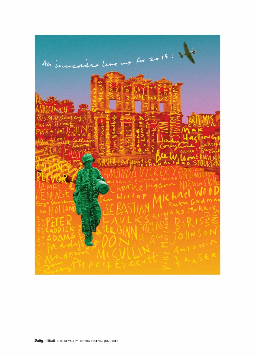
Illustrating the Chalke Valley History Festival

I 've  enjoyed working as the illustrator on The Chalke Valley History Festival. This was its third year and in a very short time, thanks to the energy and vision of the organisers, has made itself an indispensable fixture of the summer.


 It's a vivid celebration of the past; not only with its incredible A-list of authors, but also its commitment to entertaining the whole family with noise, colour and fun. This year's air show on a blistering July weekend was a triumph of organisation by James Holland, who along with James Heneage, have helped given history a kick up the curriculum ladder.


My job as a graphic designer and illustrator is to create a visual difference. What could have been burnt parchment and a gothic font free-for-all is non of these things. The reason? It's too obvious, and for a start, I try and give the speakers, from Boris Johnson to Ben Macintyre, a distinct identity within the Festival itself. 


Thanks to James Holland I'm producing work I'm proud of, which is cliché - free (apart from my own, of course) and provides the event with an exciting visual currency of its own.
Where other festivals use book jackets and head shots, we produce exhilarating and colourful work which is what history deserves, as well as the public.

Wednesday, 5 December 2012

PlumpState Christmas card 2012


This year's card is another pun. I was thinking of doing something with this Dorset beach picture as it was a nice and out-of-season-ish bit of colour that would stand out a bit from the crowd on the mantlepiece.

Occasionally, on a hot summer day where I lived as a child, the tide would leave cuttlefish stranded on the shingle at Southsea. (I think their posthumous fates were beak sharpeners for budgies). Occasionally a glistening mass of jellyfish were washed up. I thought a Yuletide might leave friendlier flotsam!

Tuesday, 24 July 2012

Blue Amy: My most popular image

BLUE AMY SIGNED OPEN EDITION £75
My exhibition at Ashley Wood Artspace was great. The private view the best I've ever been to, and the people who braved the uncertain elements were all on fine, appreciative form. Apart from a couple, but they were too drunk to care.

Blue Amy was my best-selling print, followed by Mauve Amy and Sarah Vaughan. I'm going to design a fantasy poster that includes them and Miles. I haven't decided where they'll play, but I might put them in the Quartered Heart in Norwich, or the Uncarried Load in Portsmouth.

Thanks to Anne Clements for taking so many cool pictures (a neighbour of Amy) and Richard Grosse who suggested I include this brilliant singer as a subject...

Thanks to you all. See you next year.

Monday, 18 June 2012

The Sound Of Music: John Coltrane


There's another image of the Modern Jazz Quartet to come. They, Charlie Parker and Trane all have one thing in common; they've been up-dated at the same time, so all share a stylistic similarity; the improvised turbulences, which for want of a better word provide a narrative, or some kind of sequential element... Apologies, I did need a better word, but just haven't got the time to think about what it might be! Oh, they're all called Dream Ignitions.

The Sound Of Music: Charlie Parker

This is work in progress, but the background is almost finished, and improvised entirely. Just like jazz!

There is a partial aim in making a painting about music, to have some of the  sequential properties of the subject. So these turbulent areas provide the spectator with something to work out, to decipher and I hope, enjoy. But as Donald Fagen said, "Even today, Charlie Parker can still empty a room."

I hope he doesn't at the Jazz Metrospective at Ashley Wood. But I'm happy to take my chances.

Friday, 15 June 2012

Amy: Pure Jazz


AMY WINEHOUSE by Johnny Bull

Years ago, I made a series of drawings of jazz icons including Miles, Sarah Vaughan and Pee Wee Russell among others. 

Someone suggested I should attempt one of Amy Winehouse. So here she is in full bloom. She was a fantastic singer; my favourite since Billie Holiday (who was Frank Sinatra's choice). There's no question; she was the real deal. Thanks to Richard Grosse for some timely intervention!

So she'll be up with my heroes at the Jazz Metrospective at Ashley Wood in July.

Missing her already.

(See post below http://j.mp/M2xnYd for details).

Thursday, 14 June 2012

Life drawing classes: clothed and unclothed


This is a flyer I designed to promote life-drawing classes at Ashley Wood Farm. Clare, who runs Ashley is very keen that there is a space to produce work, and also to exhibit. I'm really grateful to her for this fantastic opportunity; I loved teaching it years ago – all the pupils were women, and mostly, so were the models – I didn't so much teach as encourage and cajole, and the results, especially from the novices (though nobody, strictly speaking, is a novice at drawing) were spectacular in their energy and spontaneity.

Classes are £20 for two-hours with either a clothed model (10-midday) or nude model (6.30-8.30pm). So you pay £100 for five lessons, telling me in advance, if possible, what sessions you can attend. 

Materials needed: Drawing board (20 x 30") paper and drawing equipment (charcoal, pencils etc) 

NB Don't forget a can of fixative (it stops the charcoal from smudging). A cheap version of this is hairspray! The studio has big windows, so the smell won't hang around for long!

I want to arrange an exhibition which features drawings from these classes at Ashley Wood, where we can have a proper Private View, drink white wine and listen attentively to the murmurings of adulation from friends and public alike. 


With live music and canapes. Whatever they are.

So, I can't wait to start again. I have to get people to commit to 5 weekly classes, but if for some reason they can't make the whole block, they will be credited for the sessions they miss.

The morning sessions will end at midday, and it is hoped to extend these to a lunch at the Beckford Inn nearby.

But I mustn't get too carried away.


Wednesday, 13 June 2012

New Exhibition: Jazz pictures at Ashley Wood

http://www.ashleywoodfarm.org.uk


I've got a feeling that things might be looking up. I'm not sure why, but in the midst of a recession I've been persuaded by Clare Martin, who runs the fantastic Ashley Wood Farm, to put on a show of paintings and prints.

Mostly they will be about music, and mostly, since it is one of my first loves, about jazz. Or rather, the people who largely figure in its history. If I've got  time I'll finish the drawing of lovely Amy Winehouse (who was jazz to the bone), to go with Sarah Vaughan, a true hero.

The private view will be on 13th July, which is a Friday. If you're visiting it would be very wise to get a room at the Beckord Arms, only a few minutes away.

I'll put up more images as and when, meanwhile spread the news.

Thursday, 26 April 2012

Dorset: A new image

A SCORCHING DORSET BEACH. REFLECTION OPTIONAL!
I'd love to do a seaside poster. I love the sea and I love posters of the sea.

Oh no. Just been to the Dorset tourist Board website. Nobody conspicuous by name or phone number. Just one of those application fields that give you access to  an office I suppose. When I fill in that little box with my hopeful message saying something along the lines of, "My name's Johnny Bull, I make spectacular images of locations and events, celebrating the people in all their ..etc"  I can  then add a link to this striking image, which although modern and created and executed in the digital way, has a sort of echo of the posters of another time, when you could go from London all the way to Weymouth, or Corfe Castle by train. Makes you want to weep.

I made a similarly striking image of the Dorset Steam Fair, which I fed into a similar, depressing little aperture in one of their sponsor's websites. That was five years ago, and I never heard a dickie bird... When I saw what they were using to grab the attention of the steam brigade, I didn't bother to chase them. But with the Dorset Tourist Board, things could be different. I'll keep you posted.

Wednesday, 25 April 2012

Intellectual property: The artist's fear of the penalty (and faith restored)

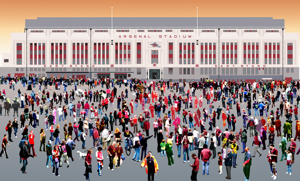
THE PAINSTAKINGLY-DRAWN HIGHBURY STADIUM
Years ago, when I'd started doing 'people prints', my friend and football fanatic, Leon, suggested I make an image to celebrate the last day of Arsenal at their Highbury stadium. It was 2006 and on 7th May I dutifully took photographs of the Gooner faithful at their swansong. They beat Wigan 4-2 and Henry scored a hat-trick. A day to remember. I painstakingly drew the old East Stand from the original plans I found.

It took me an age, maybe more than one. But, I thought the Arsenal marketing board would weep tears of relief that finally, just for once in their noble and iconic history as North London's finest, they would get to sell a really tasteful image. Well, how wrong can you be?

Sunday, 22 April 2012

Greenback: one of my back pages

SELF PORTRAIT AT THE TIME
(Includes favourite skins, and Polaroid film pack tucked into trendy denim bib)
A friend of mine, Mandy Wheeler, who's a gifted copywriter and radio producer, amongst other things sent me a message she got from a writer in America. Mandy has written an inspirational little book called Tell An Outrageous Lie, which contains nearly 200 vignettes, some real, some imagined, that are designed to kick-start the story-teller in you; to give your creative block an enema or two. (Actually, there are 188 of the critters, one of my faves: 'A picture of an offal shop, a giant snowball and graffiti saying Can you see me?')

Her friend's donation was this: 'I have a dollar bill which has a strong scent of perfume, and not an expensive one.  There's a story to be told here.' 

And in no more than 650 words.

Friday, 2 March 2012

Chalke Valley History Festival: A Manifesto of Fun.

IMAGE FOR CHALKE VALLEY HISTORY FESTIVAL 2012


I love graphic design more now than I ever did before. I love the Mac and its universe of essential tools, the software that enables me to do so much that was inconceivable when I started in the early 70s.

Now I can set type, import images and retouch them without having to wait for a courier, or a type rep from Apex or Conways, or the airbrush salesman (one of whom, a true gent from DeVilbiss, found himself fretting, in his shirtsleeves, trying to help me create a silver plate on a Procol Harum in-store display – he left at eight, telling me to eat properly and sleep well, otherwise I'd get an ulcer. But I was, and remain, an overtime glutton). 

When the Mac first started hushing-up the graphics studios, an air of thoughtful creativity took over. Gone were the days (before mine, even) of the jovial, post-pub lunch pranks from the pissed paste-up artists, blowing perfect smoke rings out of Cow-gum tins and Christ knows what else... In New York, in Mad Men days, a bored Madison Avenue agency art crew apparently enjoyed fishing for pigeons from its corner of a sky high playpen... What larks.

Wednesday, 29 February 2012

Twinkle twinkle little stars: breaking free of Google Earth.


THE STARWAY FELL UPON TRIESTE.
Google, who you may remember gave us the best search engine for like, ever, has come up with a new social marketing phenomenon called Google+.  It suits people like me better than Facebook or the dreary crushed paper cup of Linkedin.

It shows work in progress from various photographers and illustrators, one of the most prolific being the nocturnal Paul Stickland. But alas, the usual suspects always seem to rule the Google waves, like they rule the websphere with their wretched twee homilies and their pictures of a cat falling asleep on a windowsill. I used to like the Dalai Lama. But Jeeze...
They get literally hundreds of 'plusses', which is a thumbs-up from a grateful reader. I've just got an unheard-of eight for this. No, four. But still, on my Richter scale that was epic, dude.

Tuesday, 28 February 2012

Phoebe posing. A natural gif.


All in the aid of history. My daughter dressing up and posing as someone being buzzed by a Spitfire. The cover of this year's Chalke Valley History Festival brochure shows Phoebe and our neighbour, Millie, dressed as Victorians taking the air and being surprised, maybe terrified, at the sight of a Spitfire howling through the valley on the way back from a sortie.

Friday, 20 January 2012

Valentine fun: Graphic hearts and salvage


ZAZZLE HAS 'EM!

A few things that have surfaced as I try and 'internationalise' my work and sell with a degree of optimism that has so far eluded me as I stare woefully at a khaki coloured mudscape and think more dismal thoughts about the immediate environment.

Tuesday, 17 January 2012

Dare 2 Festival: Chore-free design


LOGO-FREE ZONE

Jeeeze, it's been a while since the last post, but since I don't blog from home, I haven't really had time to catch up. There's another festival looming, well, looming as Summer has every right to be in this iron-cold January day, and I've had a lot of fun over the weekend getting some images prepared for this family-friendly get-together.